Cabana Guangdong Gemini Stores Cabana大湾区双店
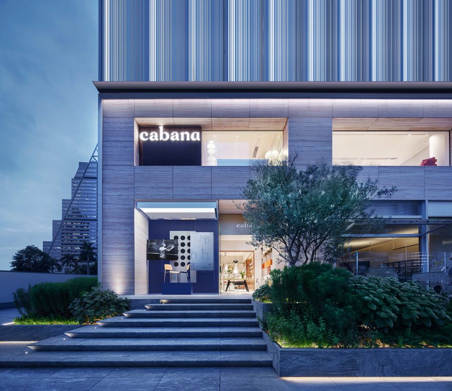
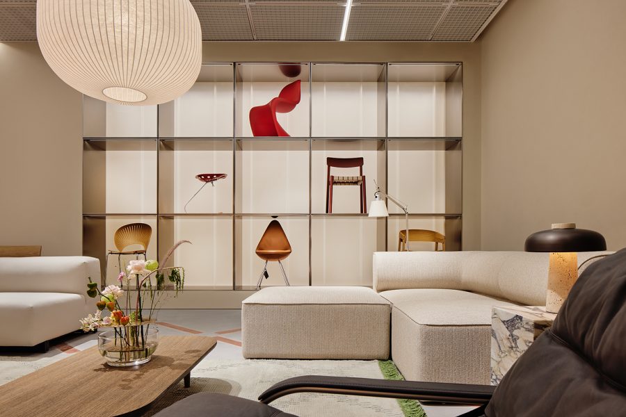
The Cabana Guangzhou Parc Central Store and Shenzhen Luohu Mixc Store are twin flowers of Cabana Furniture in the Dawan District. The design of both stores features a key element known as the “box of surprise” to connect a series of exhibition spaces with different atmospheres.
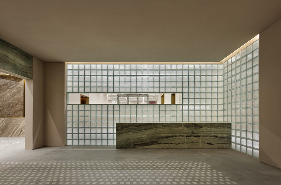
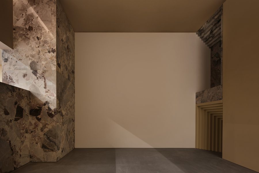
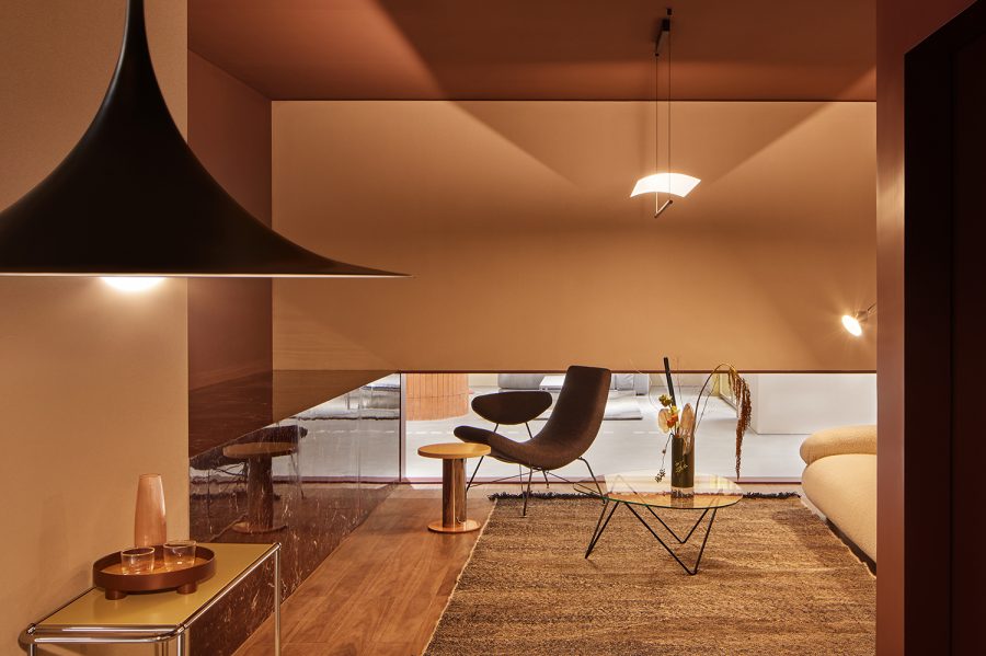
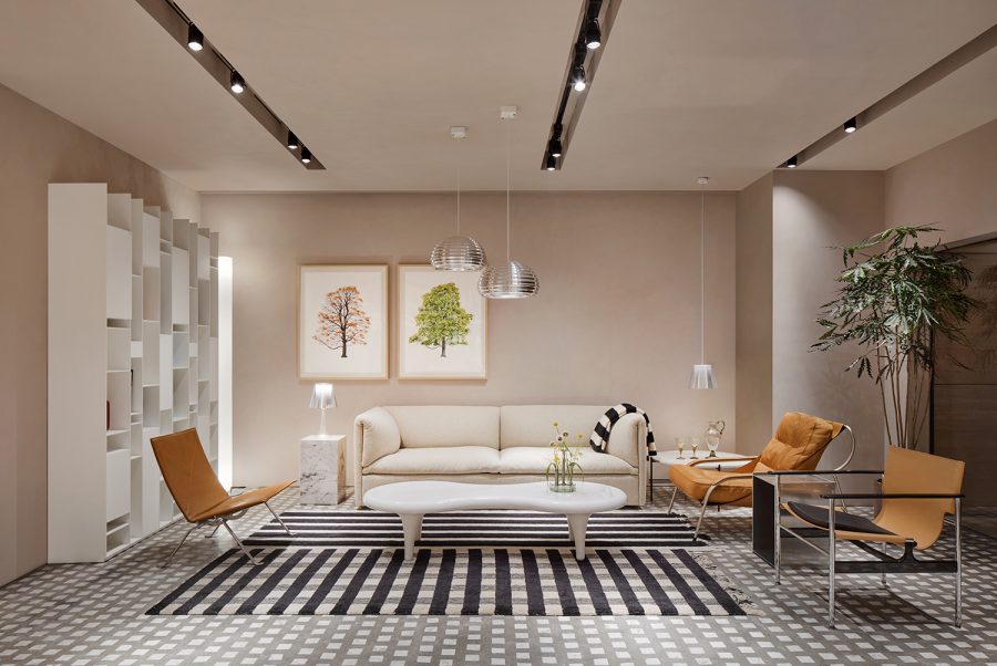
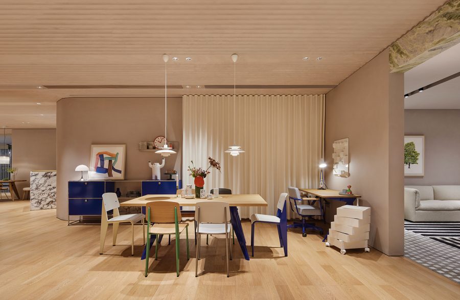
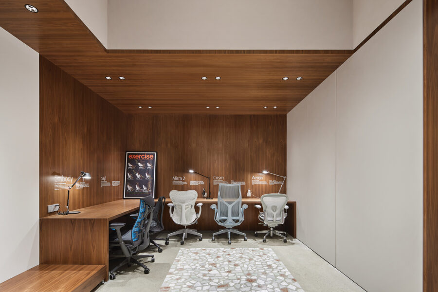
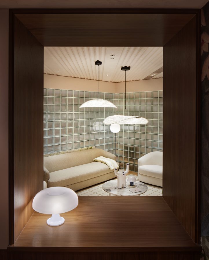
The “box of surprise” conceptualises a complex of architectural blocks of different styles and materials. In the stores, these architectural blocks function as a substitute for partition walls to define a flowing space. In the “boxes”, furniture and lighting are displayed to recreate the environment and atmosphere of a real home. Through these boxes, the space is divided into “interior” and “exterior”. By exploring both the inside and outside of the boxes, visitors will experience a richly layered exhibit.
cabana广州天环广场店和深圳罗湖万象城店,就像cabana家具店种在大湾区的一株两生花。两家门店的设计都用到了被称为“惊喜之盒”的元素,来串起一系列温度不同的展陈空间。
“惊喜之盒”是一个个风格和材质各不相同的建筑体块。在店铺中,这些建筑体块替代隔墙定义出流动的空间。在盒子中,家具与灯具的陈列模拟出人们真实居所的情境与氛围。通过这些盒子,空间被分为“内部”和“外部”。穿梭于盒子内外,访客能够体验到层次丰富的展陈内容。
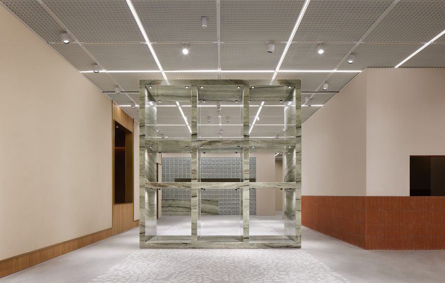
The layouts of the two stores are different, hence the organization of the boxes in these two locations, and their relationship with the surrounding environment are different.
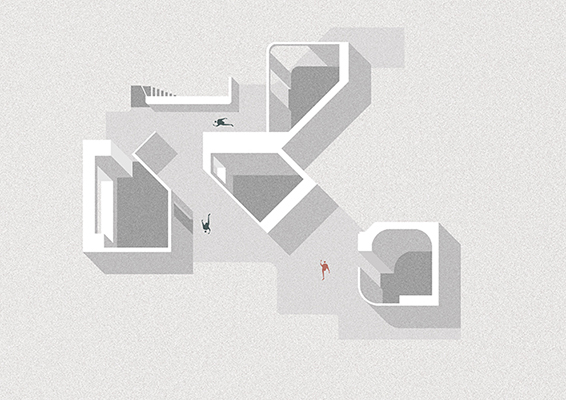
Cabana Guangzhou Tianhuan Store is located on the underground level of Parc Central in the heart of Guangzhou, with a gently spreading floor plan covering 890 square meters. The boxes are arranged in a staggered manner, simulating scenes of alleys, squares and dwellings. Inside the boxes are relatively static furniture display areas, while between the boxes form either narrow or wide-open flowing loops, unfolding a continuous path for customers to explore, encouraging them to keep moving to the next section. The thoughtfully curated furniture can be either found in the boxes in a contextual layout, or scattered in different forms of groups in the outside space between the boxes, bringing a visiting experience full of surprises.
广州和深圳两店的布局各不相同,所以盒子在这两个场所的组织方式不同,与周边环境的关系也不尽相同。
cabana广州店天环店位于广州市中心天环购物中心Parc Central地下一层,它的平面舒缓铺开,占地有890平方米。8个盒子被错落地组织在这里,将均质的展陈区划分为“内部”和“外部”,模拟出小巷、广场与住所的情景。盒内是相对静态的家具陈列区域,盒子与盒子之间则形成了或狭窄或开阔的流动回环空间,暗示顾客连续参观的路径,鼓励他们不断进入下一个全新的区域停留、探索。展陈团队精心挑选的家具,或以情境式布局摆放在盒子中,或以不同形式的组团散落在盒子间的“外部空间”中,带给人们丰富的参观体验。

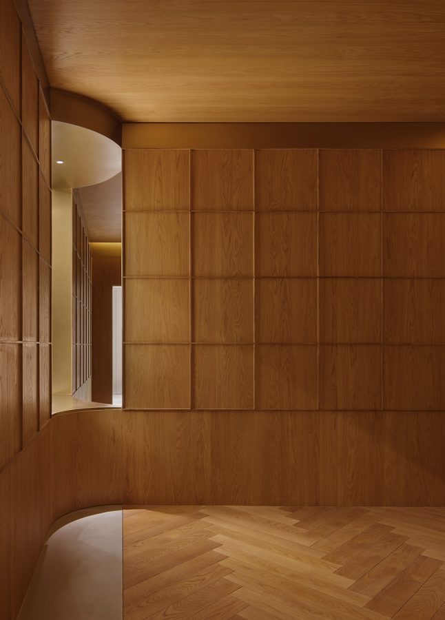
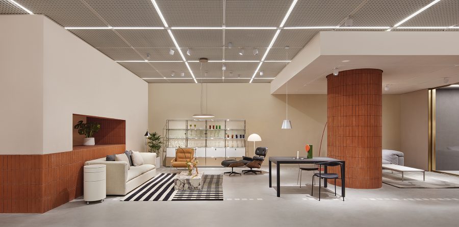
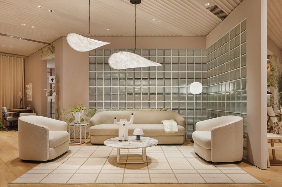
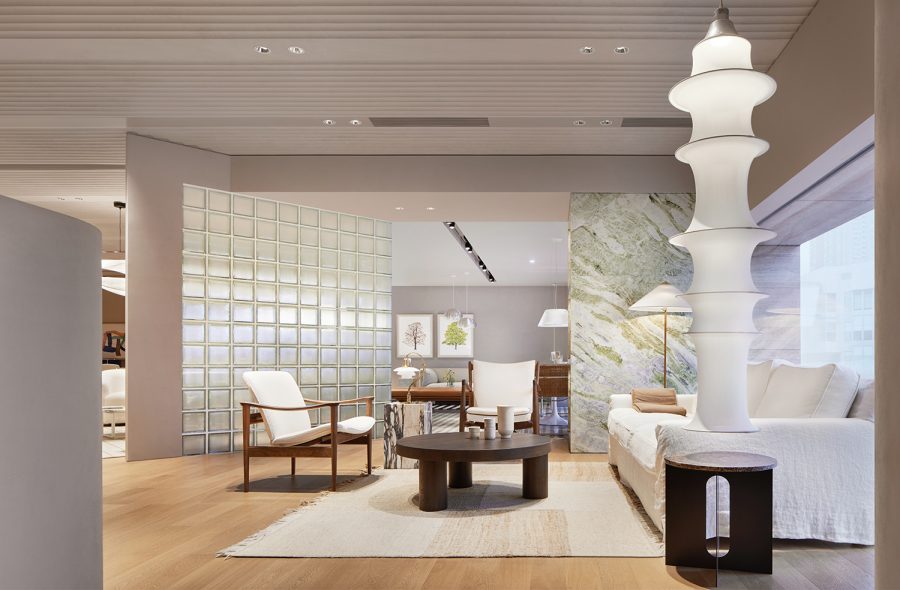
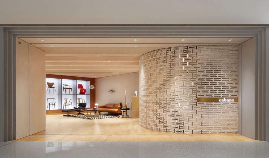
On the other hand, Cabana Shenzhen Wanxiangcheng Store is a two-storey roadside store. The ground floor is only 110 square meters, with a deep depth and a narrow width; the second floor is slightly larger, but with an expanse of 420 square meters, it is barely half the size of the Guangzhou store. In addition to the staircase connected to the ground floor, there is a second entrance leading to the atrium on the second floor. On the ground floor, the three “boxes” are conjoined as an ” entrance hall – foyer – living room” situation in a residential space. They correspond to different selling areas. The rhythm of different sections lessens the sense of depth of the unconventional space. The varies materials, such as light-colored grainy paint, dark cherry wood niches and Glamora exotic patterned wallpaper, contribute to the colourful mood of the different areas. In the middle “foyer” area, a sculptural staircase leads visitors upward to the main exhibition area on the second floor. Here, the boxes are integrated in a manner similar to that of the Guangzhou store, except that they are closer to each other with a tighter rhythm. The areas between the staircase and the entrance of the atrium are either open or enclosed, connecting groups of furniture settings like a chain of pearls. The experience of shifting views while walking makes one feel like wandering through gardens.
而cabana深圳万象城店是一个两层的当街铺面。首层只有110平方米,进深长而面宽窄;二层稍微宽阔一些,但420平方米的面积不到广州店的一半,除了与一楼相连的楼梯,二楼还有与中庭相连的第二个入口。在首层空间中,三个“盒子”串联起来如同居室中的“玄关”、“门厅”和“起居室”,对应着不同的售卖区域。层层递进的节奏减弱了狭长空间的进深感。浅色的颗粒质感涂料、深色樱桃木壁龛和glamor异域风情的暗调壁纸等等不同的材料,也渲染着不同区域的空间情绪。中段“门厅”区域,一道具有雕塑感的楼梯引着访客向上进入二层的主要展陈区域。在二层,盒子被置入空间的方式与广州店更为相似,只是相互之间的距离更近,节奏也更为紧凑。起承转合之间,从楼梯到中庭入口之间的区域或开或阖,像一串珠链,将一个个小的家具场景式组团串联起来。步移景异的体验,让人仿佛徘徊于园林之中,忍不住要继续探索的脚步。
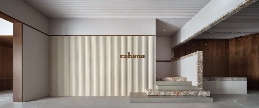
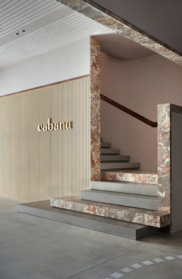

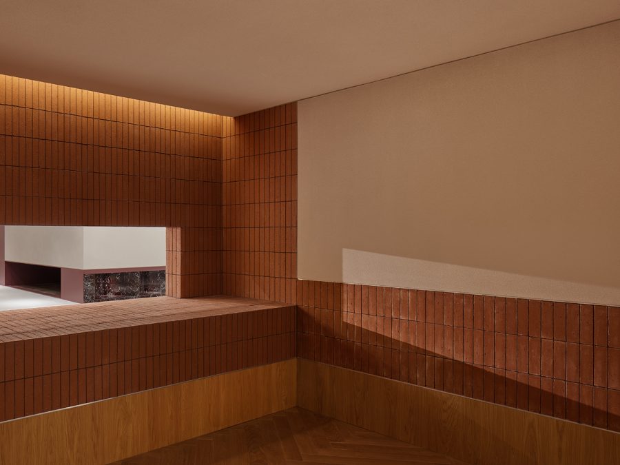
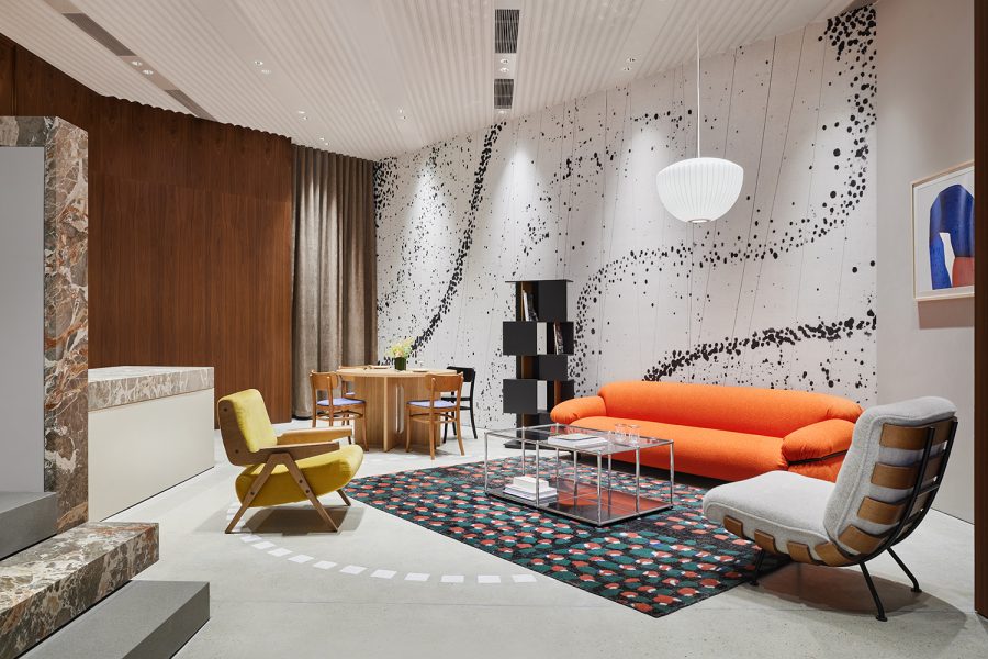
In both projects, materials are one of the most important factors. The choice of materials is based on the modernist aesthetics of the mid-twentieth century. Foundational materials such as colored marble, tile, brick, concrete, and textured paint are contrasted with soft materials such as textiles, textured glass, and wood. Different moods are attributed to the various styles of boxes and the exterior spaces between them, creating a dynamic dialogue with the extensive display of furniture.
在两个设计中,材料都是最重要的元素之一。材料的选择是基于二十世纪中叶的现代主义美学。彩色大理石、瓷砖、砖块、混凝土、质感涂料等基础材料,与纺织品、质感玻璃、温暖的木材等软性材料形成对比。将不同的情绪赋予各种风格的盒子和它们之间的“外部空间”,与琳琅满目的家具陈列形成富有张力的对话。

Project details
-
PROJECT LOCATION 项目地点: (Guangzhou/广州店)Parc Central, Tianhe district, Guangzhou, China 中国广州市天河区天环广场
-
PROJECT LOCATION 项目地点: (Shenzhen/深圳店)The Mixc, Luohu district, Shenzhen, China 中国深圳市罗湖区万象城店
-
WORKING RANGE 工作范畴:Interior Design / Façade Design 室内设计 / 立面改造
-
TYPOLOGY 项目类型:Commercial 商业空间
-
BUILDING AREA 建筑面积 (m²): (Guangzhou/广州店)900 m²
-
BUILDING AREA 建筑面积 (m²): (Shenzhen/深圳店)530 m²
-
PROJECT STATUS 项目状态:Built 建成
-
DESIGN STARTING 设计开始:2022/01
-
CONSTRUCTION FINISHED 项目落成:2023/01
-
PRINCIPLE DESIGNER 主持设计师:蔡为
-
DESIGN TEAM 设计团队:陈海霞, 吴佳轩, 贵溥健, 吴雨星, 陈石见
-
LIGHTING CONSULTANT 灯光顾问: (Guangzhou/广州店)Lumia Lab 麓米照明
-
CONSTRUCTION 施工方: (Guangzhou/广州店)Bonmy Design 中山邦迈设计工程有限公司
-
CONSTRUCTION 施工方: (Shenzhen/深圳店)Beijing Million Partner Construction Company Limited 北京亿达和信装饰工程有限公司
-
PHOTOGRAPHY 摄影师:黄早慧@AGENT PAY


